“No matter where you are, whether it’s a quarter mile away, or half way across the world. You’ll always be with me, and you’ll always be my brother.”
— Dominic Toretto
This is the first post on my new blog. I’m just getting this new blog going, so stay tuned for more. Subscribe below to get notified when I post new updates.
Designer vs Developer #22: How to create a design system
In this blog, Google Design Advocate Mustafa Kurtuldu discusses motion design, prototyping and the three layers of material design.
A design system is a set of principles that helps guide designers trying to navigate a platform, environment or ecosystem. Sometimes they impose restrictions and force rules, but a good set will always seek to guide.
Roman architect Vitruvius had three golden rules for great architecture:
Durability (Firmatis ): The building should be robust and remain in good condition.
Utility (Utilitas): The building should be functional and useful for the people who are in it.
Beauty (Venustatis): The building should be delightful and soulful.
Designer vs Developer #20: How Chrome was designed 10 years ago
In this blog, Google Design Advocate Mustafa Kurtuldu speaks to Darin Fisher, VP for Google Chrome, about designing a web browser and the evolution of Chrome during its 10 years of existence.
Google controls almost 70% market share for searching engine. There is no doubt that google chrome plays an important role on it.
Google is a company that makes a search engine that is referred to as Google. A search engine is a website that allows to find other webpages by typing as keyword.
Google Chrome is a web browser made by Google. A Web Browser is a tool that lets you view other webpages, including the Google search engine.
For example, a web browser is like a car: it lets you get to all the different places. A search engine is like a map: it helps you find different places without knowing the address.
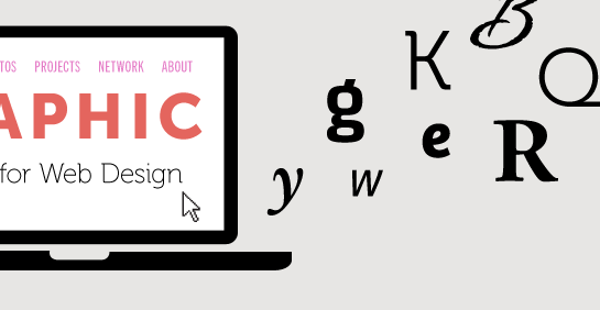
Typeface is commonly referred to as a font or font family, but it’s actually a set of fonts designed with common characteristics composed of glyphs. Font refers to the individual files that are a part of the font family or typeface. Serif typefaces are distinguished by small, decorative lines usually at the top or bottom of the letters. Sans serif typefaces don’t have these decorative lines.
Hypertext Markup Language (HTML) is starting point, which is used to add content and structure the page and is the standard markup language for documents designed to be displayed in a web browser.
Cascading Style Sheets (CSS) is for presentational effects and styles and is a language that describes the style of html. In other words, it shows the elements which should be displayed, such as colours and fonts.
JavaScript is used for adding interactivity, such as clicking through an image gallery, or dynamically changing content with a button click or a page scroll.
CSS font families: there are two types of font family, generic family and font family respectively.
Generic family – a group of font families with a similar look (like “Serif” or “Monospace”).
Font family – a specific font family (like “Times New Roman” or “Arial”).
To set the font family in your web projects, use the CSS property font-family. It’s recommended.
Not all operating systems have the same fonts installed, or the user may have deleted it. If the user doesn’t have the font installed locally, your font-family declaration won’t display properly.
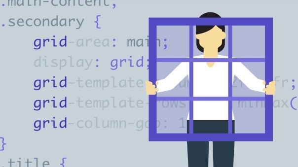
CSS Grid is a foundational change where web layouts are concerned. This is the first true two-dimensional layout tool that allows us to approach what is displayed in the browser view port as a whole rather than a random assortment of loosely related parts. Using CSS Grid introduces a whole new approach to web layouts and web design.
This makes things like positioning text on top of images absurdly easy and does away with the complex absolute positioning and other hacky solutions we’ve been using so far. On the downside, if you don’t play close attention to where you place your items, you can easily cover something important.
Grid track is the space between two or more adjacent grid lines, either horizontal or vertical.Row tracks are horizontal, column tracks are vertical. A grid area covers one or more cells and the purpose of a grid area is to define an area within the grid that can be referred to when grid items are placed.
Grid gap creates uniform gutters between each track, and you can choose to define a column gap, a row gap, or a gap for both columns and rows.
Grid cell is the smallest unit on our gird, a grid cell is the space between four grid lines. It is like a table cell or we can say that It is like a block that we can fill in media content such as images videos or text.
Grid area is any area of the grid bound by 4 grid lines and contained by many grid cells.
You need to know who your audience is and how they behave before you can build a successful site. Different audiences have different needs. For example, two people looking at car reviews might want very different information from the review. A car enthusiast will wantdifferent information highlighted. Things like horsepower, torque, speed. Than a small business owner such as a florist, who cares much more about fuel economy, service intervals, and storage capacity.
You need to spend some time thinking about who exactly you’re going to optimize the sites design for. It’s worth the time to sketch out the attributes of the visitors you care about,what they value, what their goals are, and what concerns might stop them from using your site.
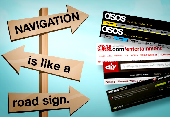
In order to design a site that people enjoy using, you need to know what motivates them.When people use the web, they’re almost always doing so to find information. Because people are coming to your site with a specific goal in mind, it’s important that you help them quickly reach that goal. Clear navigation absolutely would enhance users’ experience.All elements of the page should be helping to tell the story, and if they don’t help, you should get rid of them.
There are also some special navigation menu such as product for online shop to introduce their products and give a further purchase information. And there is also a part called FAQ which is finding answers and questions, which is really useful for new viewers to find answers that people always ask.
For years, accessibility has been seen as the domain of the developer. There lots of things that happen in code to make sure that digital things are accessible, but design and content are just as important, or maybe even more important
You need a great mix of accessible design, accessible development skills, and accessible content.
One of the most obvious tools we use is color. We use it as a design element in meaningful ways. Color communicates status, and helps us distinguish one thing from another.A study has showed when customers are at first sight or view a good or product with a subconscious judgment in 90 seconds. Almost 90% of them would focus on and pay attention to the color of this product.
But in fact, one in 12 men, and one in 200 women have some form of color blindness. That means that about 4.5% of the world’s population is going to have difficulty perceiving different color combinations because of color blindness.So the use of shapes in web design is also important.
One of the most important requirements for accessibility is keyboard usage. Because this actually affects people with many different types of disabilities. You also make it accessible to people that use other assistive technologies like voice recognition software, switches, or other devices.
In general terms, aesthetics is an area in philosophy in which practitioners study beauty as it relates to art. Plato first spoke of the pleasure brought onabout by the quality of beauty. Good designs communicate a mood, or a feel that goes beyond the content in the design.
Design influences everything, and we can find examples of it everywhere we look. We see design in our furniture, electronic equipment, in our food packaging, our transportation, our clothing, our architecture, and our technology. We experience design at every turn.
Graphic and web designers often learn about the formal principles and elements of design. You can think of the elements of design as the basic components involved with creating any design.
Color, value, texture, shape, form, space, line and type are eight elements of web design.
In web design,the designer not only consider the meaning and relative importance of the site content, but also to reflect on the user’s experience,and to anticipate visitors’ habits and needs.
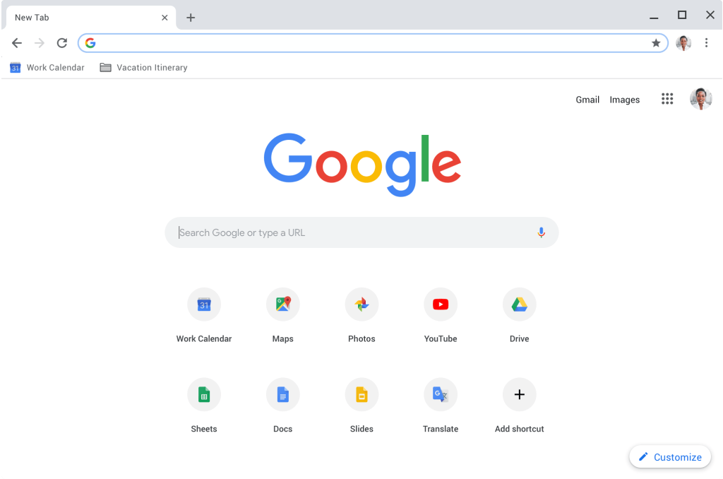
I think all of us are familiar with Google, which is a website that we use almost every day.Its overall design is very simple, but it is most convenient for users to use.
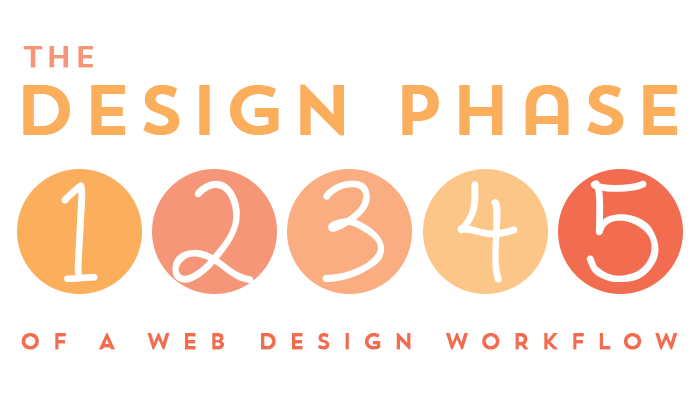
A web design workflow is the process you follow, or the series of steps you take, as you develop a design for a website.To work efficiently, there should be some logic and order to the tasks you perform to create the design. New designers and seasoned designers alike can benefit from seeing one possible set of steps, which can then be followed exactly, or adapted to any existing workflow. The main goal is to work as efficiently as possible while reducing redundancies and streamlining the design process.
Now, I will show you how a perfect design workflow looks like for myself.
Step 1-Kick off meeting This is the first step of the whole project, and it is also a very important step. All team members should discuss the plan and content of the project and reach an agreed result, which is helpful for everyone to understand the whole project.
.Step 2-Discovery & Research Research is crucial for every website. You should analyze your competitors and target users to develop a site that better meets users’ needs.
Step 3-Architecture & ContentArchitecture can help you craft your content more quickly, and without that step, it’s easy to make a lot of effort.
Step 4- Website & WireframeThis step will allow you to see the results before you design your site.
Step 5- Web design
Step 6- Web prototype
Step 7- Web Development
Step 8-Assessment & ReviewMake sure there are no problems with the website before it is published.
Step 9-Launch & Evaluate
Step 10-Improvement & MarketingMake the website better able to meet users’ needs and attract more users.
The two common image file formats for the web are jpeg and png. Jpeg is the file format best suited for photographic images on the web. It allows you to compress the image data to achieve a small file size which is important since every web image has to be sent across networks, downloaded, and rendered in a browser so the smaller an image is, the faster it can load, but there is a trade off. In order to reduce file size, the jpeg format causes images to lose some of their detail. This is why it’s called a lossy file format, but the good new is with GIMP you can control the amount of compression that’s applied to your images and preview the effects of the compression.
The questions on the Illustrator ACA and those main objectives are: project setup and interface, organizing documents, and publishing digital media. And it contains five topics which are about working with colleagues and clients, plus legal, technical and design related issues.
We could also prepare and optimize our images so that they can look their best when we’re creating JPEGs, which will be viewed online, say in our blog or portfolio, or on Facebook, or whatever.
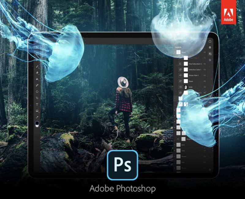
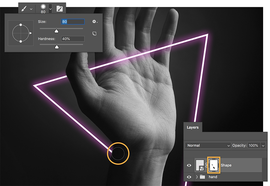
I think most people are visual animals, so we should maximize the use of such powerful software as Photoshop, through Photoshop we can make a lot of shocking pictures in the network or life to attract people’s interests.
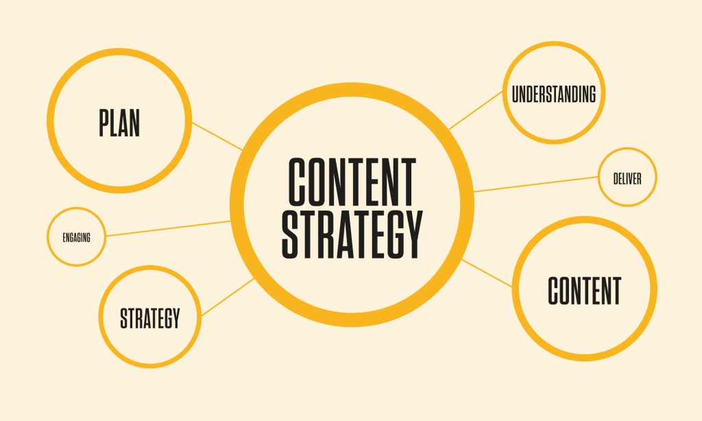
What is content? It’s everything.The definition of content on Wikipediais information and experiencesthat are directed towards an end-user or audience. In my opinion, content is the feeling or information we can get from everything of everybody, such as a movie, a show, a song, a class or a teacher. We could extract content anytime and anywhere in our lives.
Content strategy is about bringing the right contentto the right person and right place at the right time, in the right context, and making sure it’s accurate, up-to-date, and appropriate through ongoing engagement. For this to happen, a communication of ideas must take place, requiring an in-depth understanding of an audience, their needs, and their communication style. It is not just about creating a message. It’s about giving the message the best possible chance of reaching and being understood by its intended audience and planning for and creation, delivery, and governance of useful, usable content that, in turn, helps you reach business goals.
As I said content strategy is about bringing the right contentto the right person and right place at the right time. What’s that mean?In my opinion, the right content is the message and feelings you want to convey to the audience, and of course, they must be positive and meaningful. The right person is the audience who you want to transfer your content to. The right place is in how or where your content is published. Right time refers to a mature time, for example, news focuses on timeliness, while the Right time of some events needs to wait for the fermentation of things.
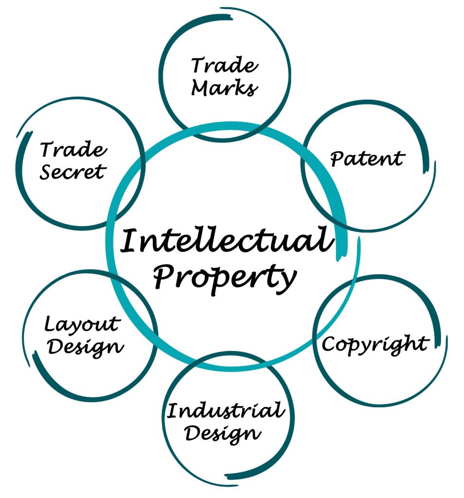
This blog is about the functions of open source and its principle. It’s really important and essential to the new beginner who just start to learn coding and how to design the websites. We need to know which public information and sources we could use form open internet to help improving our websites and which we could not use.
It is the intersection of intellectual property and open-source principles that yields open source licensing. The most authoritative source for guidance comes from The Open Source Initiative. The organization’s website can be found at opensource.org.
This means everyone could have a chance to access to the source with source open in shared source scenarios.The code you get from the open source project must not require a royalty or any other fee. The program must include source code and must allow distribution in source code as well as compiled form. This goes to the core of what open source is all about.
For myself, it’s a good way to learn when I look through website with a good layout and have a look at its page source.
Open-source licenses allow software to be freely used, modified, or shared, while respecting the original programmer’s authorship and intent. This is not a coding course. Rather, it’s an exploration of the legal and business aspects of open-source software licensingNow, the most popular open source software is Android which is also one of the most influential open source software. I think most of people who do not use Apple products use Android every day. Also, if it were not for the open source of Android, there would not be so many mobile phone manufactures and the rise of the mobile internet.


 ShuiMei Qu's Blog